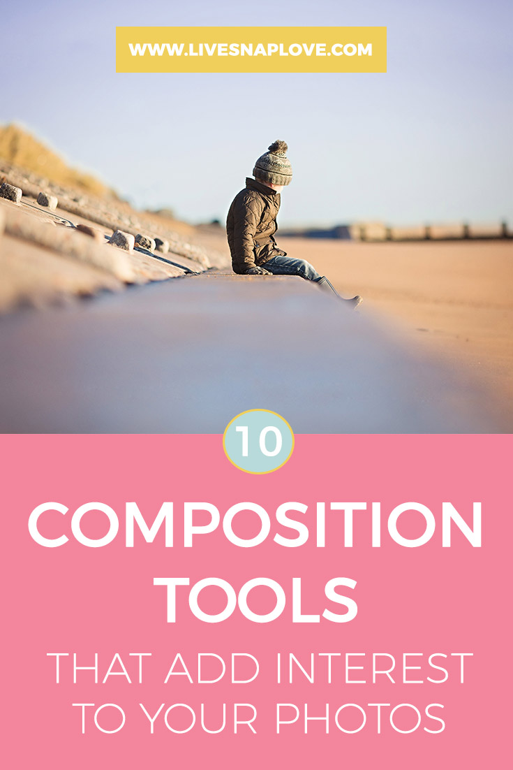
10 Compositional Tools that Add Impact to Your Photos
After you have mastered the basics of photography, it's time to get started on the fun stuff - and for me, composition is one of them! Interesting composiiton can take an ordinary lifestyle image and elevate from a snapshot into something much more artistic so it's worth wrapping your head around a few tools!
So, today, I'm running through some compositional "rules" (I say, "rules" but really you should think of them more as guidelines to experiment with) that I think can add the most impact to your images.
1. Rule of Thirds
Let's start with the basics shall we?
The rule of thirds is one of the most basic principles of composition in photography. What you need to do is imagine that your photograph is divided into nine equal sections by two horizontal and two vertical lines (as shown below) Apparently, when we look at something, our eyes are naturally drawn to the points where these lines intersect. Placing a point of interest on one of these intersections, or placing elements along one of the lines, gives the photo more balance and is more appealing to the viewer. You can read more about using the Rule of Thirds here.
2. Framing
One way to make a picture more appealing is to create a frame within a frame. You do this by simply positioning some elements in your picture so that they create a natural frame for your subject. This helps draw your eye to the main subject, and helps create depth to your photos. Framing can come in many many different forms - for example they could be part of a building such as window, an element of the outdoors such as trees, or even one created by light and shadow.
3. Leading Lines
Lines that lead to your subject will help guide your viewers eyes to the main purpose, subject or story within the image. They can also be used to show motion or just to add a feeling of depth.
4. Colour
A lot of people tend to forget about colour as a composition tool, but it is incredibly useful for creating a mood within a photograph - for example cool colours can make your viewer feel more calm, and vibrant warm colours can invoke excitement. They can also be used to draw your eye to the subject - a pop of colour against a plain background for example. The absence of colour (by converting to black and white) can also be a compositional choice.
5. Reflections
Again, not many people think of reflections as being a composition tool, but finding reflections provides a sense of symmetry and repetition (both compositional tools in their own right!)
6. Texture
Showing texture adds an extra dimension to a photograph, and makes it look more 3D - like you could reach out and touch it. You can add texture to your portrait images by using side lighting (which shows up texture more) or introducing different fabrics or just finding an interesting textured backdrop.
7. Fill the Frame
Fill the frame with your subject when you want to focus on the smaller details or just want to exclude background distractions. Macro is a good one to fill the frame with, but portraits can often be compelling when they fill the frame too.
8. Orientation
There can be a tendency when you are starting out to shoot only in horizontal or only in portrait orientation. Switch it up - use horizontal when there are strong horizontal lines in your image and vertical ones when there are strong vertical lines in the image. Of course, you can break this "rule" depending on what you want your final image to say, but unless you have a compelling reason for doing so, stick to this rule, and it will help your viewers eye travel the scene more naturally.
9. Create Depth
When we take a photograph, we are compressing images into 2D, flattening the scene in front of us. Our job can be to create depth, to make the image more 3D, so that the viewer feels more like they are able to explore the scene in front of them. Leading lines and framing are two ways of creating depth, but you could also try layering foreground, middle and background elements.
10. Use your Depth of Field
When shooting an image, it's important to keep your viewers eye on what's important in the image, and we do this by ensuring our subject is in sharp focus, leaving the rest to fade into blur. This can also create bokeh "texture" which helps with #6 above! This simple trick of using depth of field to our advantage is one that you should be taking advantage of and can really help with portraits or everyday life images.
I hope this has given you some ideas of composition tools to try! Remember, learn the basic rules, and understand why and when you would use them - pull out the tools that best help tell the story you want with your image. Once you have the basics down, learn more, or just break the ones you already learnt! With nearly every compositional "rule" there is another that comes along and flies directly in the face of it, so don't be afraid to experiment. Sometimes something just "works" even when it's not meant to!


